How to create a simple and effective color palette.
/Color palettes are one of my favorite components of a brand style guide to develop. I’ve always had a keen sense of color and enjoyed working for a number of different brands over my career that pushed the boundaries on color combinations. From the floral color palettes of Disney’s Tinkerbell to the vivid hues of Vera Bradley’s iconic prints, I’ve seen it all AND press checked many types of product on many different substrates.
When choosing a colors for a brand or for a client project, there are 3 simple tips you can follow to create a simple and effective palette.
1. Choose 2 colors the reflect the brand. Thinking about who your brand is and who it serves are key. It could be a color that speaks to the type of product that’s created or just one or two that resonate deeply with your brands ethos and mission.
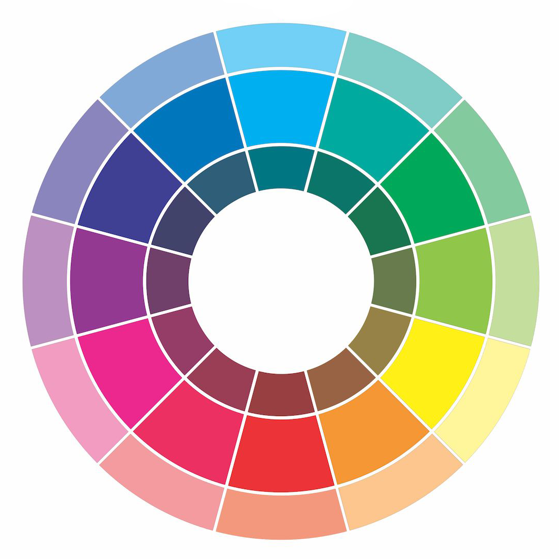
2. Add in a monochromatic shade. Choose a monochromatic shade of one of the brand colors. This will allow you infuse the brand color but in a more bold or subtle way depending on the hue. This comes in handy with color overlays. See the chart below.
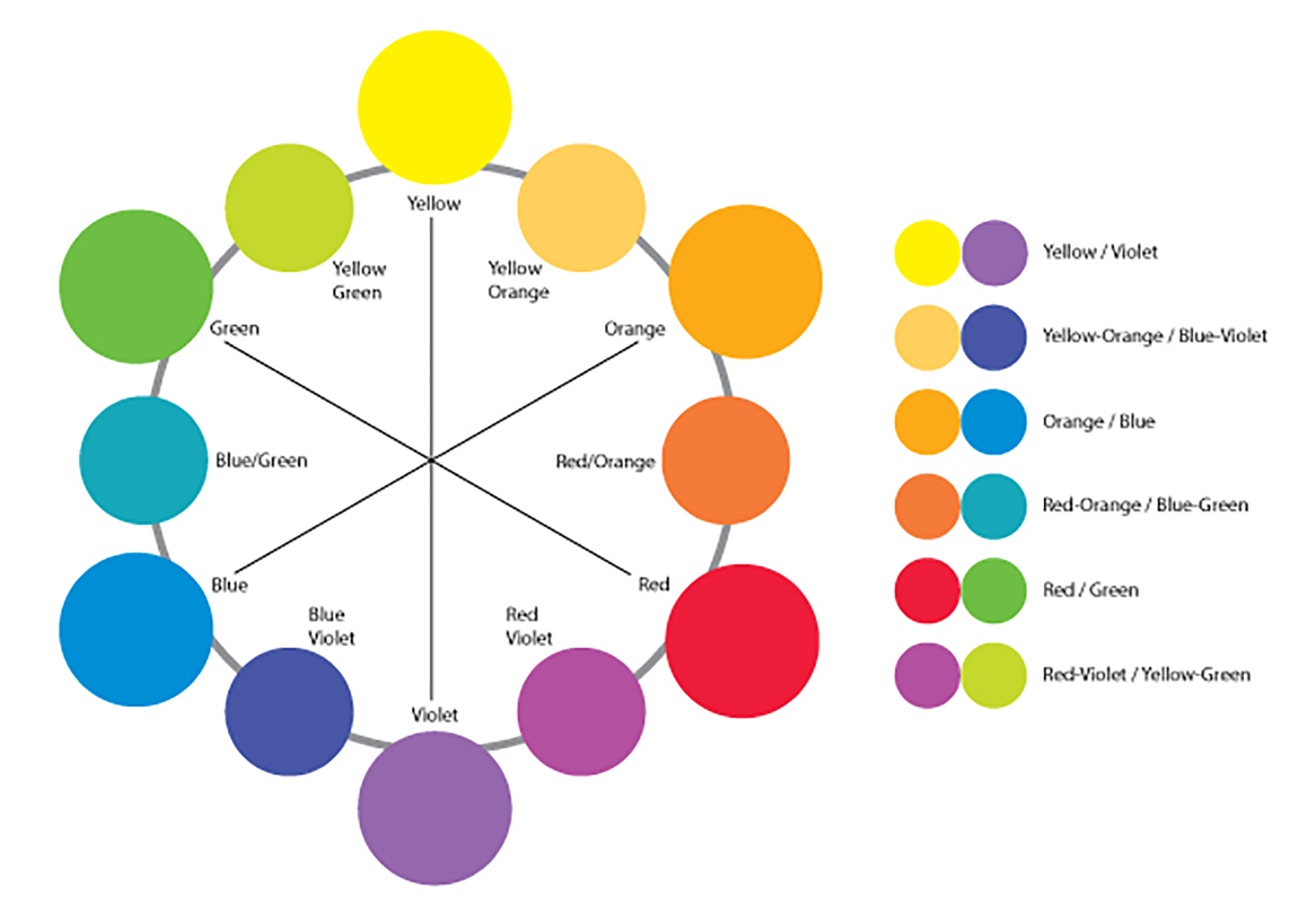
3. Add a complementary shade. Choose a complementary shade to one of your original colors that reflects your brand. This color will be directly across from your brand color on the color wheel. For example if you have a brand color of blue than the complementary color would be orange. This allows for a warm/cool tone variant in your palette. See the chart below.
Following these 3 simple rules will allow you to create an intention and most importantly impactful color palette that will allow your brand to stand out in a crowd. Sticking to these color consistently will allow your brand to be recognized and create trust with your viewer. Making your job easier when it comes to working within a brand style guide.
If you need help creating a solid brand look and would like to inquire about my Brand Building and Brand Development services please reach out via my contact page HERE.


